
In the current digital era, users expect websites to perform flawlessly on any device they use. Responsive web design (RWD) is a method that allows your website to automatically adjust its layout, images, and navigation according to the screen size, creating a smooth and enjoyable user experience.
What is Responsive Web Design?
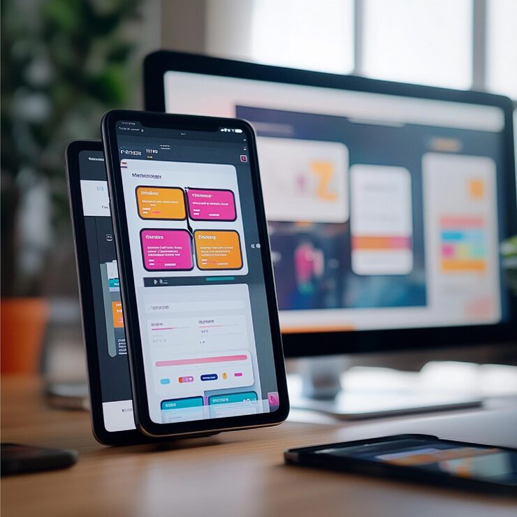
Responsive web design is the practice of designing a website so that it dynamically adapts to different devices, from large desktop monitors to small mobile screens. Unlike traditional fixed layouts, responsive sites use flexible grids, scalable images, and CSS media queries to ensure content looks great everywhere.
Benefits of Responsive Web Design
1. Seamless User Experience
Users can access your website without frustration, whether they’re on a phone, tablet, or desktop. This keeps them engaged and more likely to return.
2. Boosts SEO Performance
Search engines prefer mobile-friendly sites. A responsive design improves your website’s ranking, making it easier for potential customers to find you.
3. Cost and Time Efficiency
Maintaining a single responsive website is simpler and more cost-effective than managing separate versions for desktop and mobile users.
4. Increases Conversion Rates
A user-friendly, accessible website encourages visitors to take action—whether signing up for a newsletter, making a purchase, or contacting your team.
5. Future-Proof Your Website
With new devices entering the market constantly, responsive design ensures your site will remain functional and visually appealing without frequent redesigns.
Best Practices for Responsive Design
- Prioritize a mobile-first approach
- Use flexible grid layouts and scalable images
- Optimize font sizes and button placement for touch screens
- Test the website on multiple devices and browsers
- Minimize heavy media to improve loading speed


.jpg)